Our Favorite Neutral Interior Paint Colors That Work For All Styles
Selecting paint colors when designing your home is fun, but it’s also a challenge. Sure, maybe you know you want white walls, but who knew there were over a thousand different shades of white? From whites with yellow to blue undertones – how do you know which will work best in your space?
If it’s time to freshen up your walls with new paint, then you don’t want to miss this post! We’re rounding up our favorite interior paint colors, along with helpful tips you should know when making your selections.
What to Keep in Mind When Selecting a Paint Color
Nothing is worse than going through the trouble of painting a room and then realizing the color just doesn’t work. That’s why before we dive into our paint recommendations, we wanted to cover important factors you should consider before even looking a paint swatches, so you don’t end up regretting the color you choose.
1. EXISTING COLOR SCHEME
If you’re not starting with a totally blank slate, or renovating a space entirely, then you’ll need to select a paint color that works with the existing design of the space.
Ask yourself if your current furnishings, finishes, and materials have a color scheme. Be mindful of the undertones in the design elements that aren’t going to change, like countertops, tile, and flooring. Are these tones warm or cool? Select a color with the same types of undertones so the space will be cohesive.
2. LIGHTING
Both natural and artificial light affect the way color looks. The same paint color could look totally different depending on the time of day, the location of windows, and the lighting sources and types of bulbs used.
That’s why you’ll need to consider all the lighting in the room when selecting a paint color.
3. TEST BEFORE YOU COMMIT
For both reasons above you’ll want to test out paint colors before you decide on the final color. Just because you like the paint swatch, doesn’t mean you’ll like it on your walls. If you’re drawn toward a single color, test out a few similar ones just to be safe.
We recommend painting samples on the matte side of a large poster board and then taping it up in the space. Be sure to use 2-3 coats to see the true color. You’ll want to leave it up for a full day or two and look at the color(s) at different times of day — morning, early afternoon, late afternoon, and evening. Have different lights in the room on and off throughout this time as well. You’ll then see how the color changes when exposed to different light, and you’ll figure out what works best in the space under all lighting conditions.
Instead of using a poster board, another option is to paint samples directly onto your wall. But if you do, first paint a coat of primer so the new color is not affected by your current wall color.
By testing a color or a few different shades, you’ll be sure to pick the one that works best, avoiding the need to repaint later.
Best Interior Paint Colors
At CGD we love starting with a neutral foundation and then adding personality through layering and texture in accents and finishes. That’s why all our top paint colors are in the neutral zone: white, gray, dark blue, and black. Keep reading to learn more about our top picks and see what may be a good fit for your home.
Best White Paint Colors
White is one of the most popular paint colors because it acts as a great neutral backdrop for any space. But it’s also one of the hardest colors to choose because there are so many different shades from eggshell, ivory, pearl, and cream… the list goes on. If you love white walls, then keep reading to learn about our favorite whites.

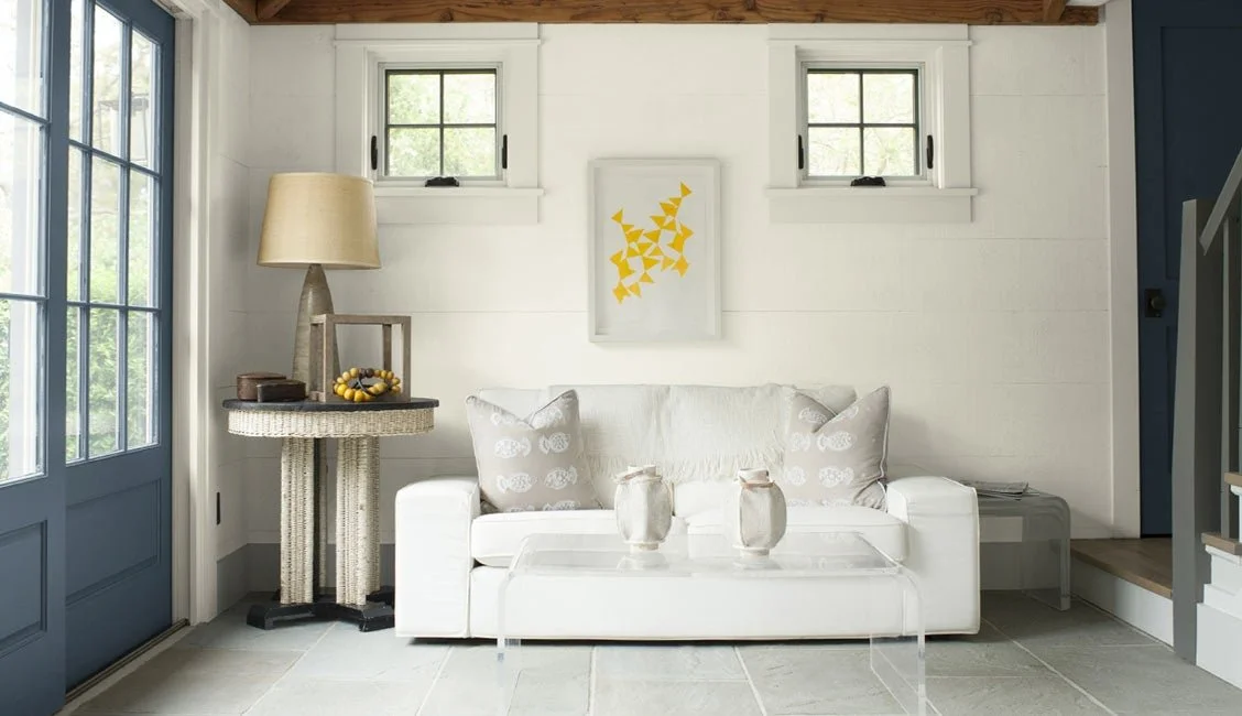
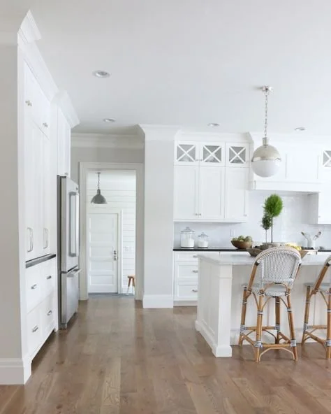
White Dove by Benjamin Moore is a best seller for a clean and classic white. This is our favorite white paint because it has a soft warm undertone that doesn’t end up looking too yellow. It’s definitely one of the most versatile whites out there.
We used this color in the living room and kitchen of our North Hampton project. The clients had a very bright white paint throughout their home and wanted to change it to a softer, warmer white. We knew that White Dove was the perfect solution.

For a warm and creamy white, you’ll love Westhighland White by Sherwin Williams.
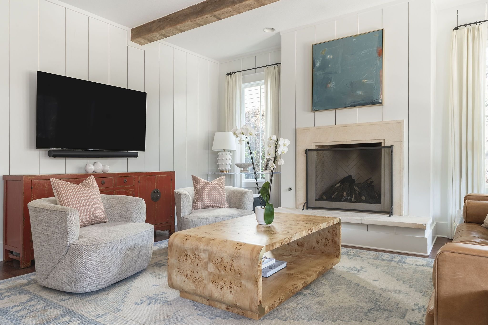
This paint was the best choice for the living and dining rooms of our Rugged Earth project. The stone fireplace in the living room has beige and yellow undertones, so we needed a warmer white with some yellow undertones, but not too yellow. With Westhighland White, we got the ideal balance.

If you want a crisp white with slightly cooler undertones that’s still soft and welcoming then Chantilly Lace by Benjamin Moore is a great option.
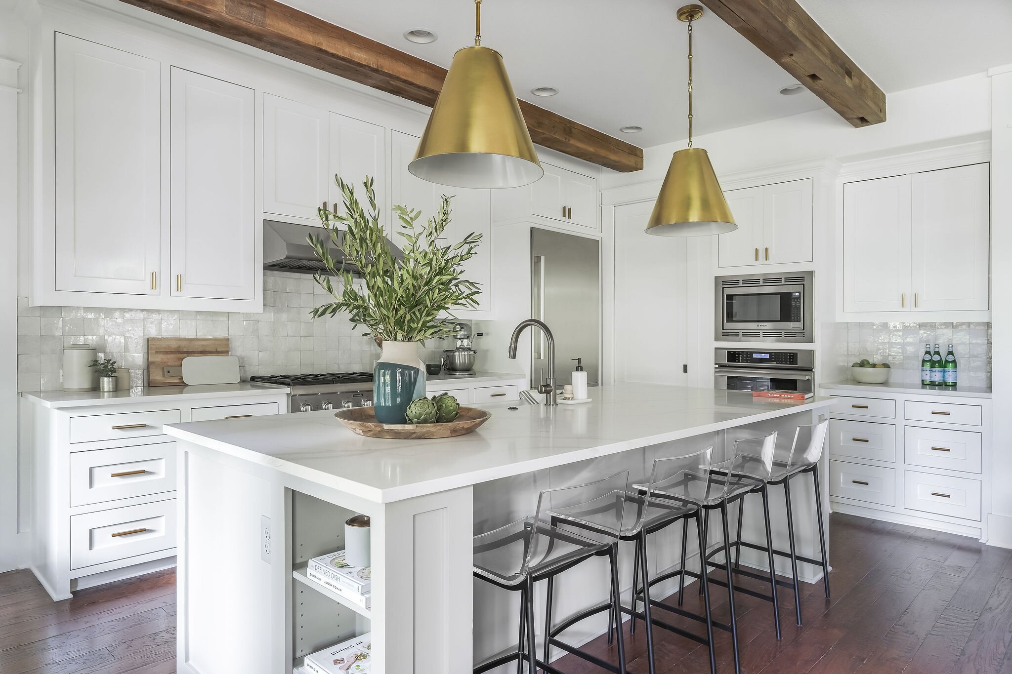
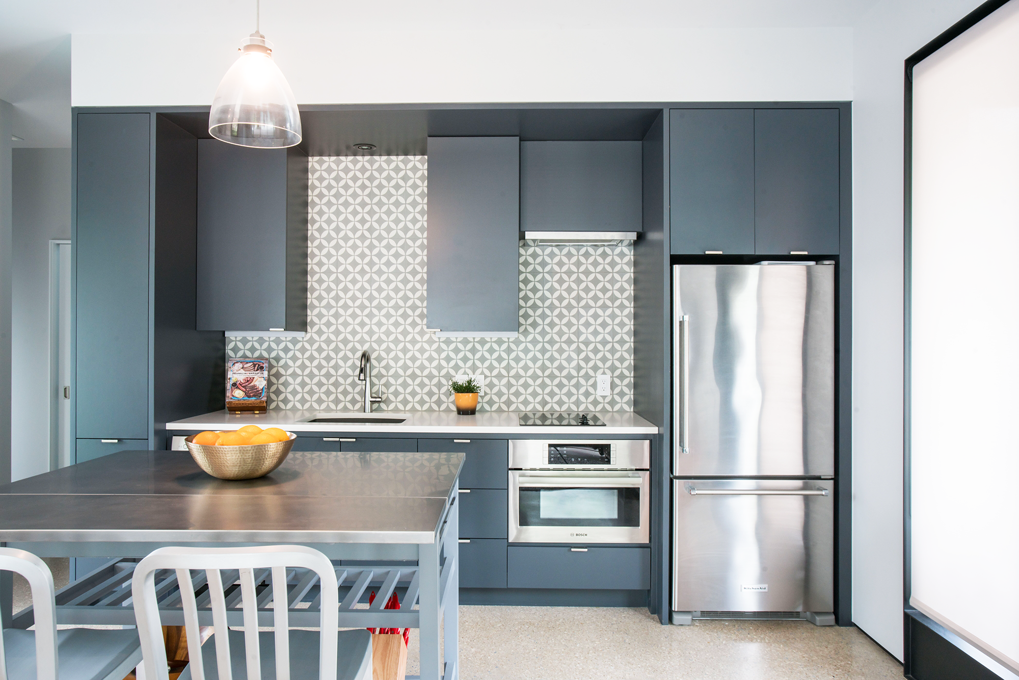
For the living room and kitchen cabinets of our Beverly Road project, this was the winning selection. It compliments the blues and greys we incorporated throughout the space, as well as the medium wood tones.

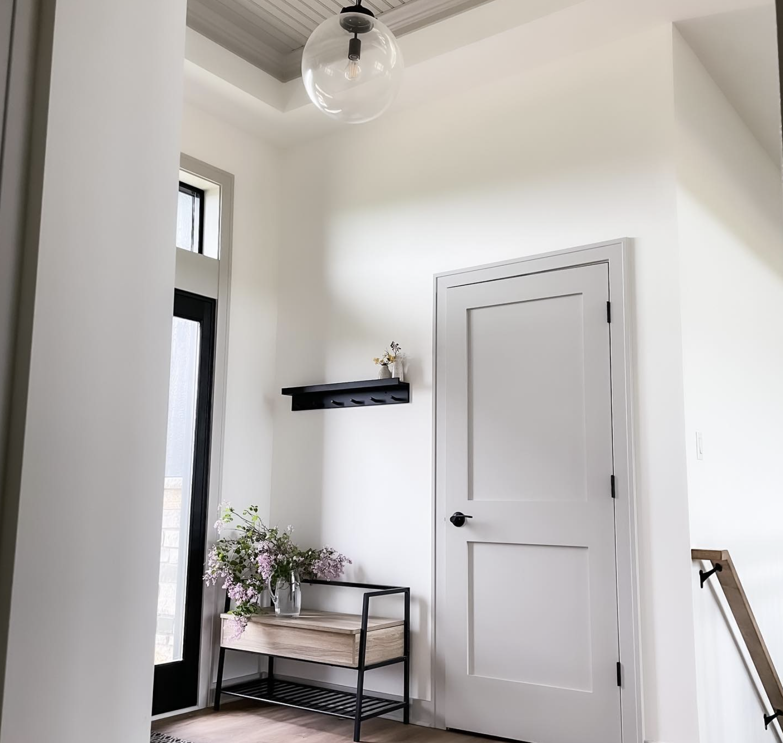
For a more muted white with warm undertones, Alabaster by Sherwin Williams will create a cozy and welcoming environment.
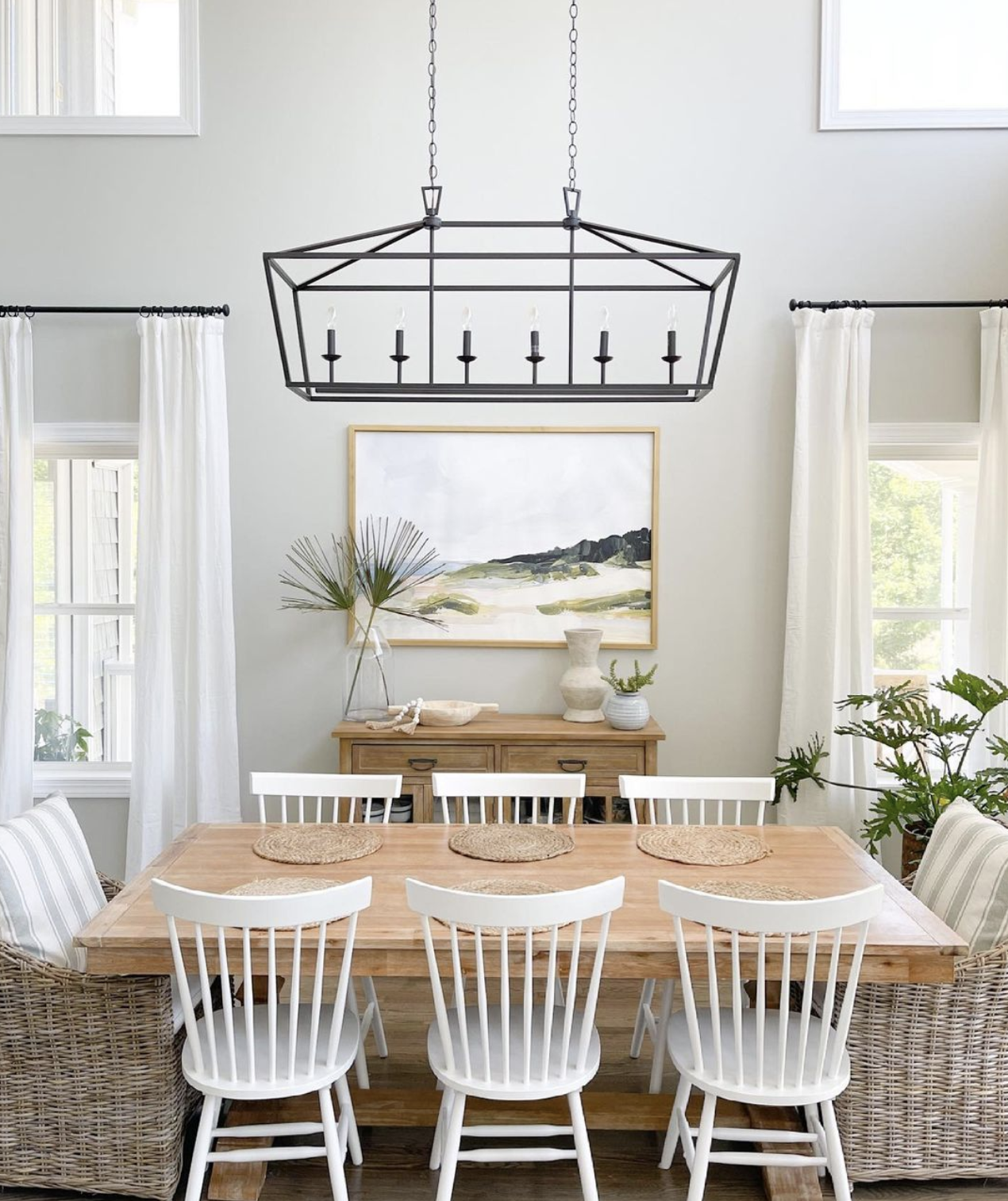
We used this color in the living room, kitchen, and entryway of our Serene Estates project. It provides a great neutral pallet for the warm grays, taupes, and light to medium wood tones throughout these rooms.

Similar to Alabaster but just a touch cooler with some gray undertones is Snowbound also by Sherwin Williams. It’s another versatile choice, that works with warm and cool colors.
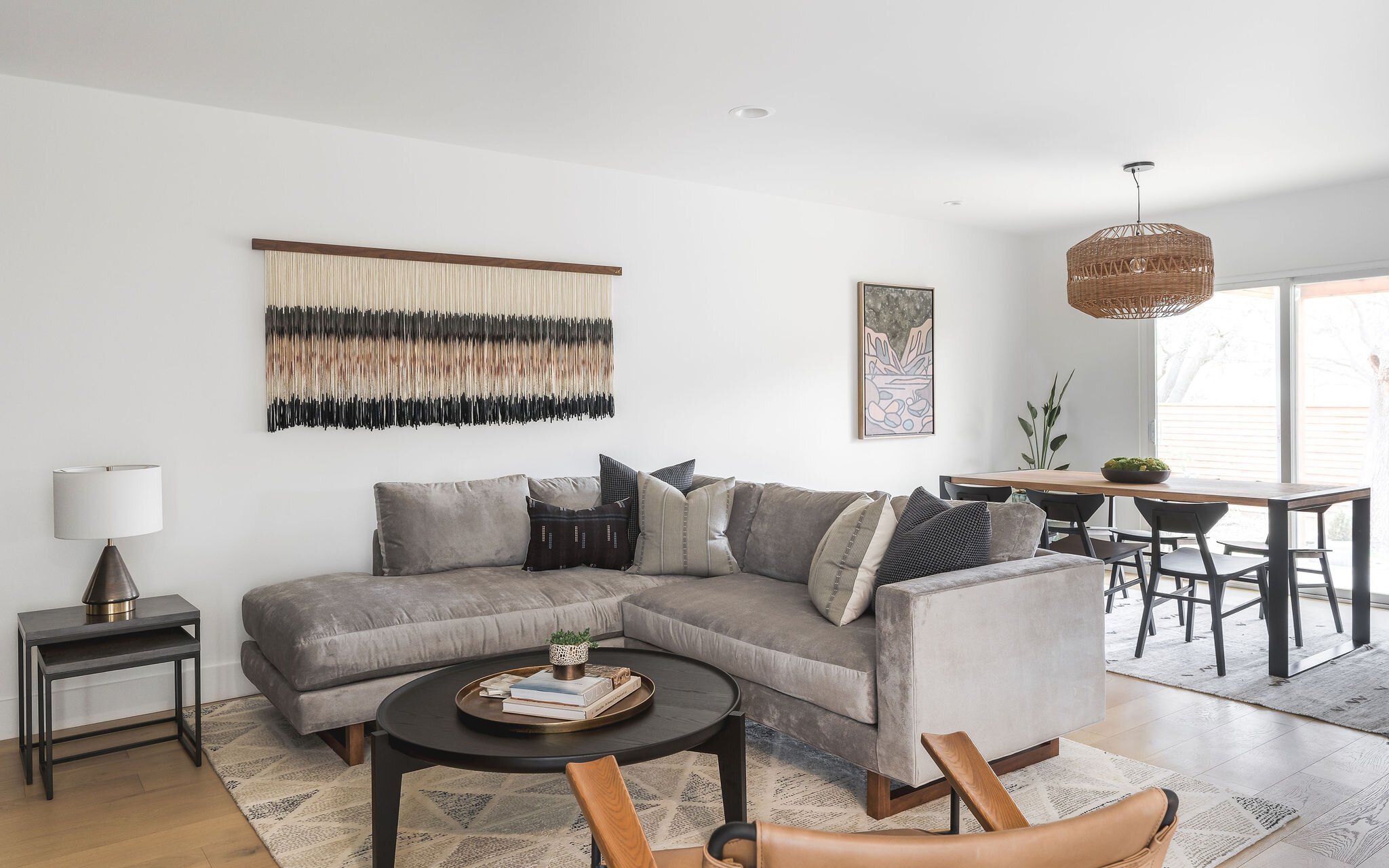
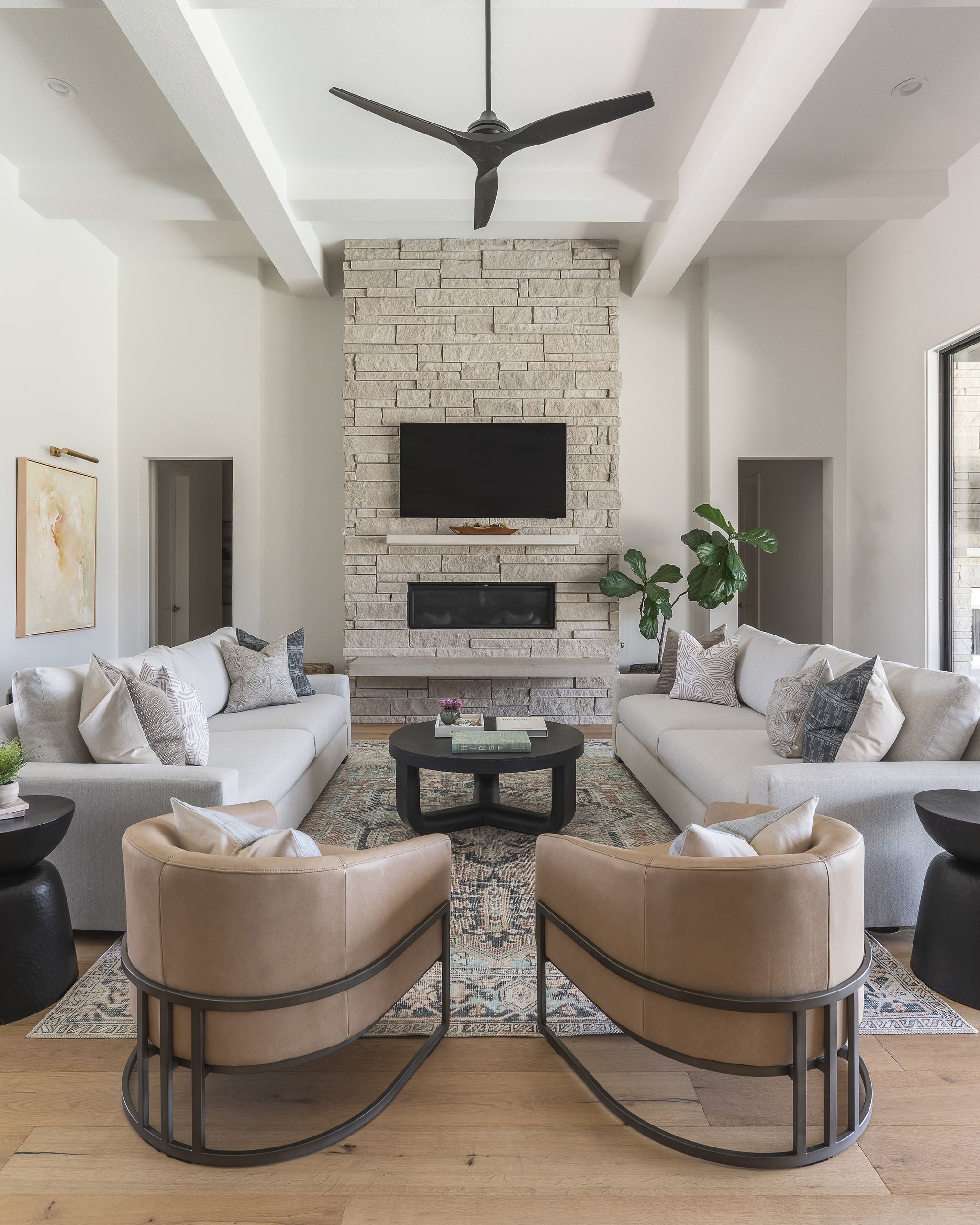
We choose this one for the walls, ceiling, and trim of our Cardinal Flower Drive project. The tall ceilings in the dining and living rooms really benefit from this bright white color, making the spaces feel even more expansive. It also works well with the new furnishings in those spaces, the light gray sofas, black dining chairs, and tan leather swivel chairs.

A gorgeous classic white, with just a hint of warmth, is Simply White by Benjamin Moore. If you want a traditional white, that’s not too warm or too cool, then this is a great option. One of the whitest of the whites, it’s very versatile and suitable for any room in the house.

If you’re looking for white paint with a bit more warmth and golden undertones then Greek Villa by Sherwin Williams is your white. Perfect for coordinating with earth tones – warm grays, greens, navy, and browns.
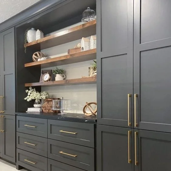
Best Gray Paint Colors
Second to white, gray is a very popular paint choice for its versatility. White doesn’t work for every space and isn’t for everyone. If you’d like a hint of color while still remaining neutral then gray is a great option. Here are our favorite gray paint colors.

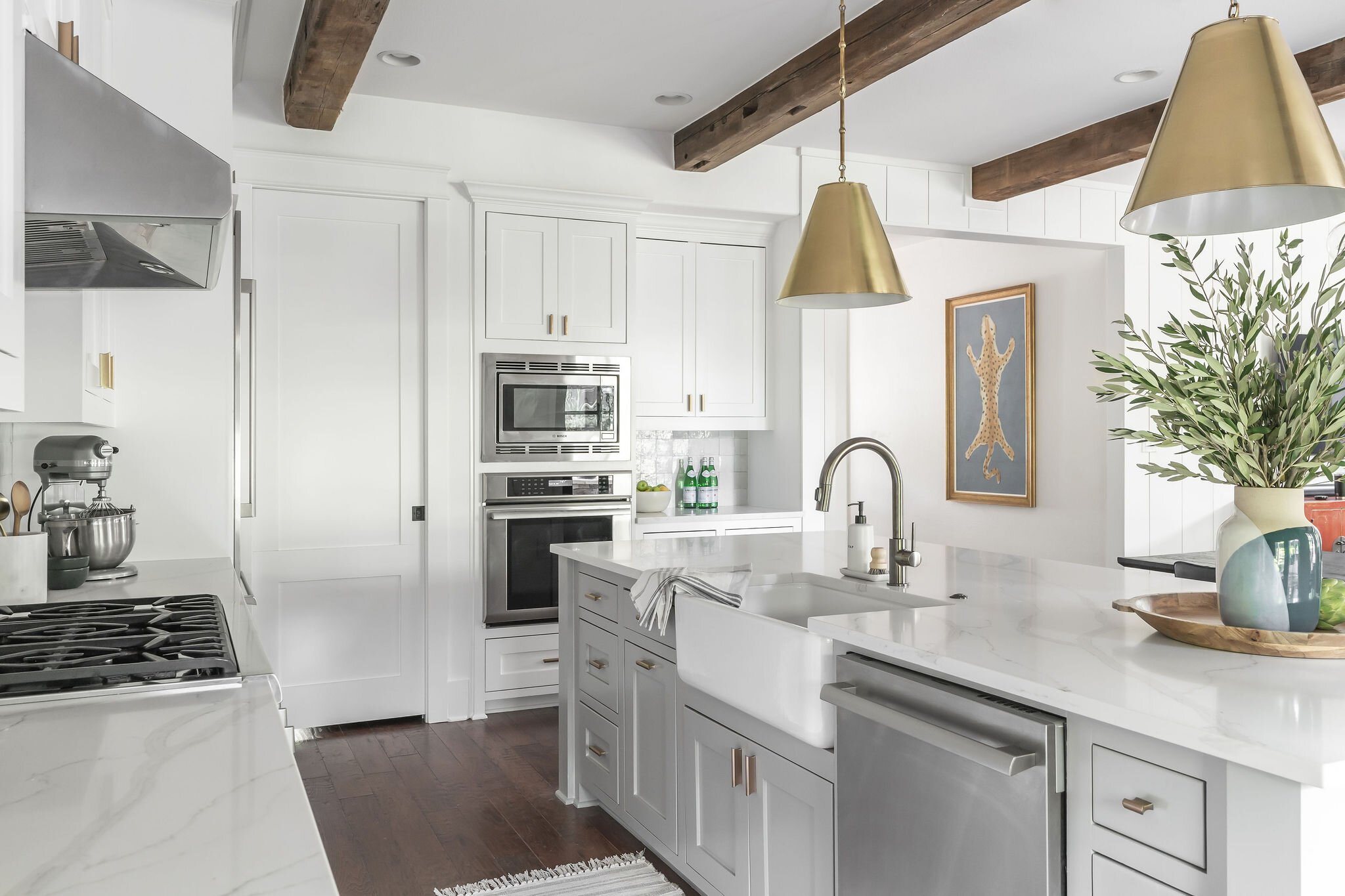
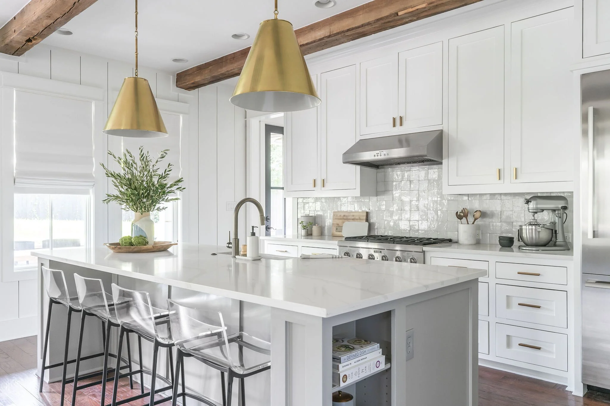
For a true, neutral gray Repose Gray by Sherwin Willams, is your best bet. It’s extremely versatile and works with different textures and finishes.
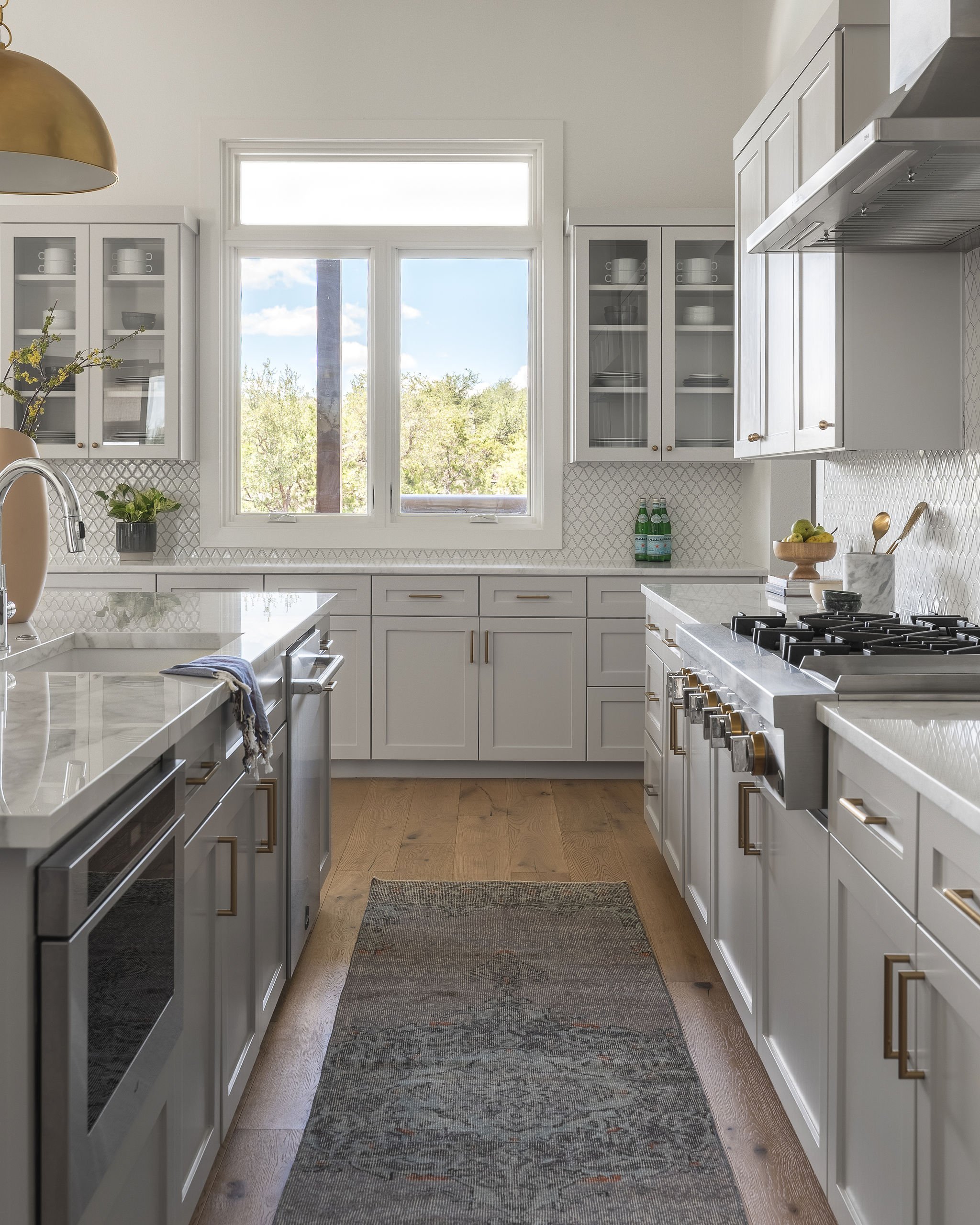
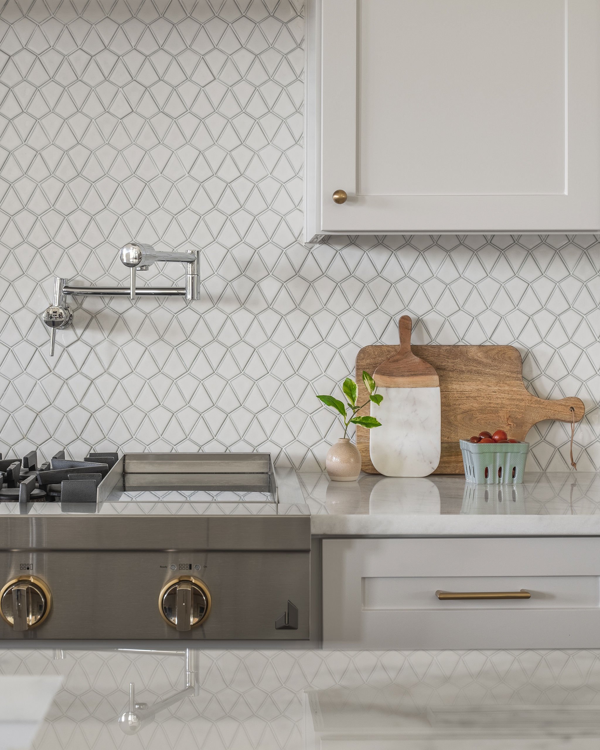
We’re using this one for the kitchen cabinets in our Cardinal Flower Drive project. It’s a soft gray so it fits perfectly with all the other kitchen elements including both black and white marble countertops, gray tile backsplash, and natural wood accents.

If you’re looking for a pale gray with warm taupe undertones then Balboa Mist by Benjamin Moore is one you should consider.
For the kitchen cabinets of our Serene Estates project, this subtle gray color coordinates seamlessly with the Alabaster walls, warm wood flooring, and bar stools. This color choice helps soften and balance the space, preventing it from looking too stark and white.

If you prefer a very light gray, that’s almost off-white then Classic Gray by Benjamin Moore is your gray. It adapts to most surroundings and is perfect for when you want the slightest hint of gray.

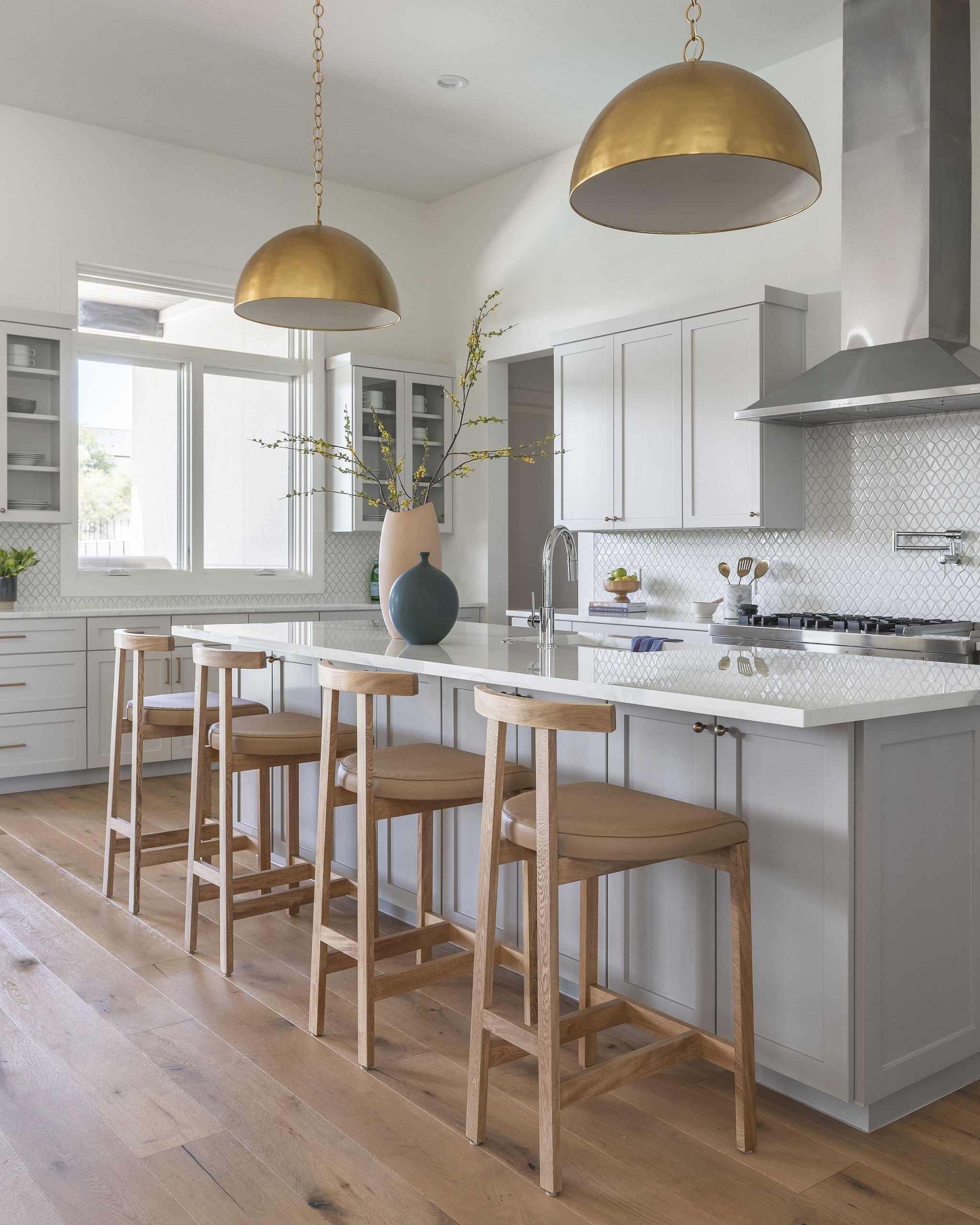
When you want a true medium gray that’s not too dark and not too light then look no further than Dorian Gray by Sherwin Williams.
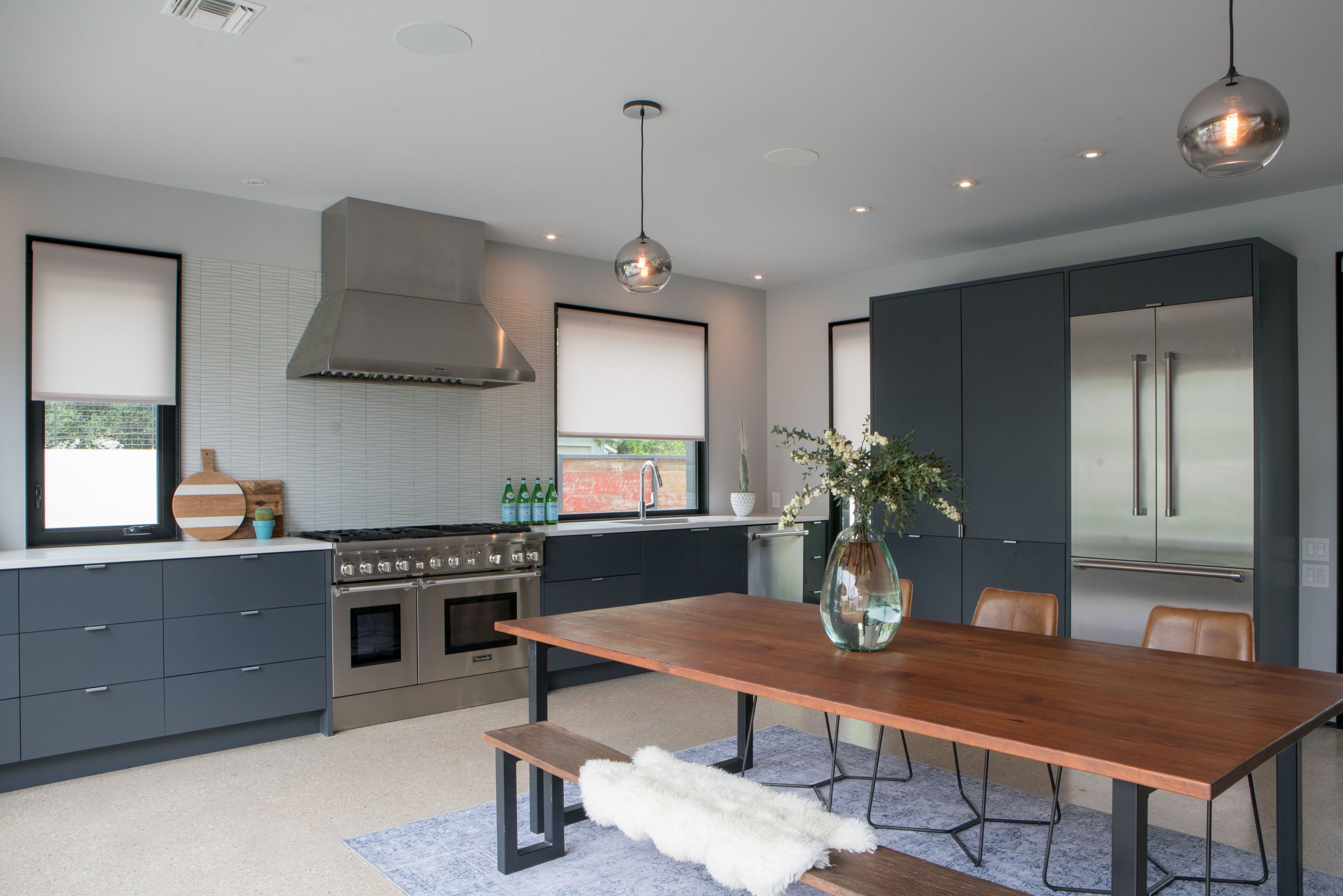
In our Beverly Road kitchen, we needed a gray for the base of the island to contrast nicely with the Chantilly Lace cabinets, tile backsplash, and marble countertops. Dorian Gray ended up being the perfect shade for the space.

For a medium-dark gray with subtle green/blue undertones, Pigeon from Farrow & Ball is a gorgeous option.
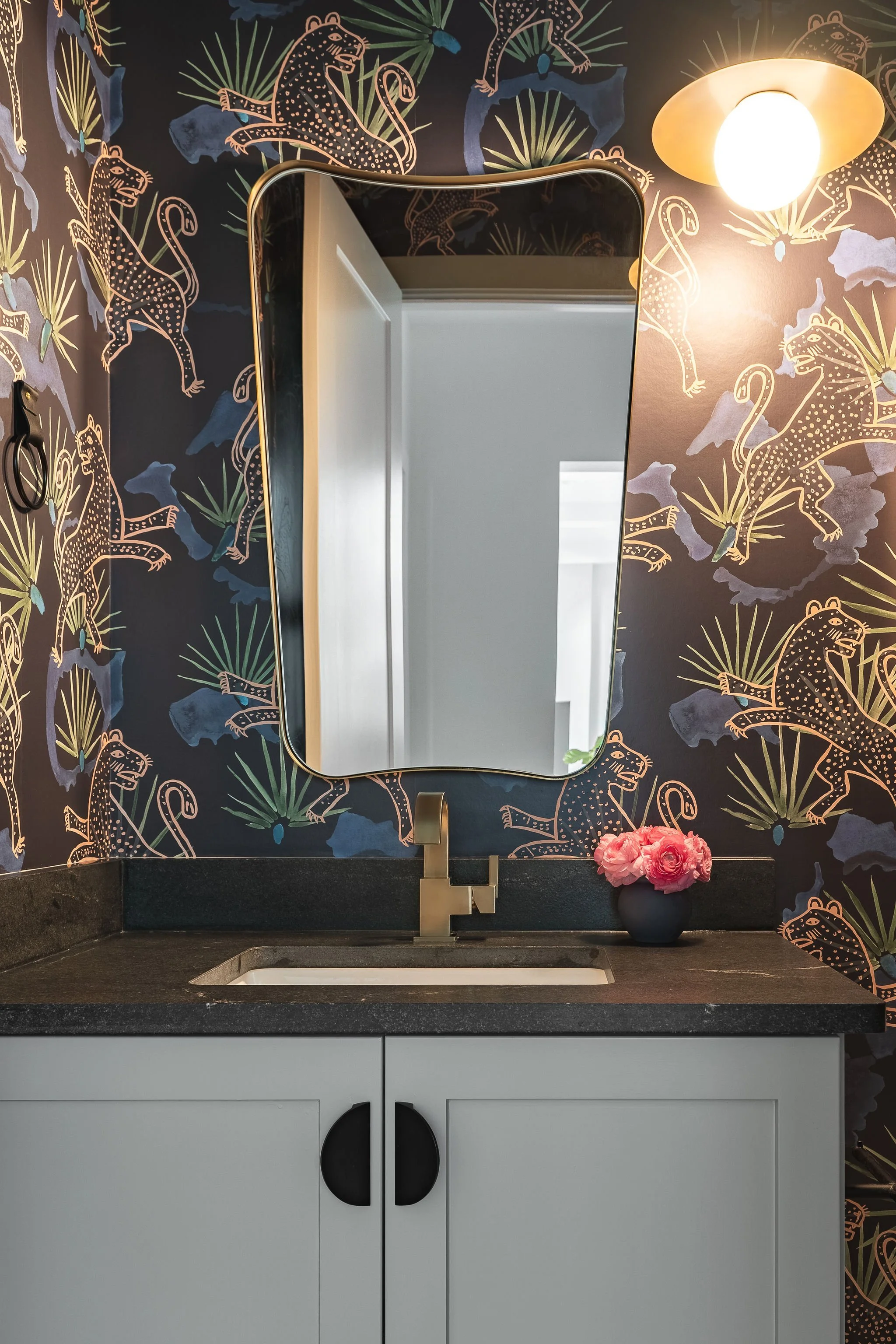
The vanity cabinet in our Serene Estates powder bathroom needed a strong gray to go with the bold tiger patterned wallpaper and dark fishes. Pigeon balances all the other design elements flawlessly.

If you’re looking for a truly timeless gray that’s endlessly versatile then Mole’s Breath by Farrow & Ball is the one for you.
For the powder bath of our Bouldin Creek project, we needed a color that would coordinate with the existing grey textured backsplash. Mole’s Breath ended up being the perfect choice to integrate seamlessly with the tile while creating a moody and zen atmosphere.
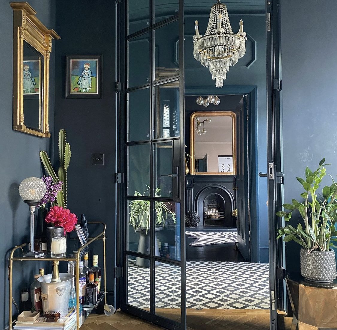
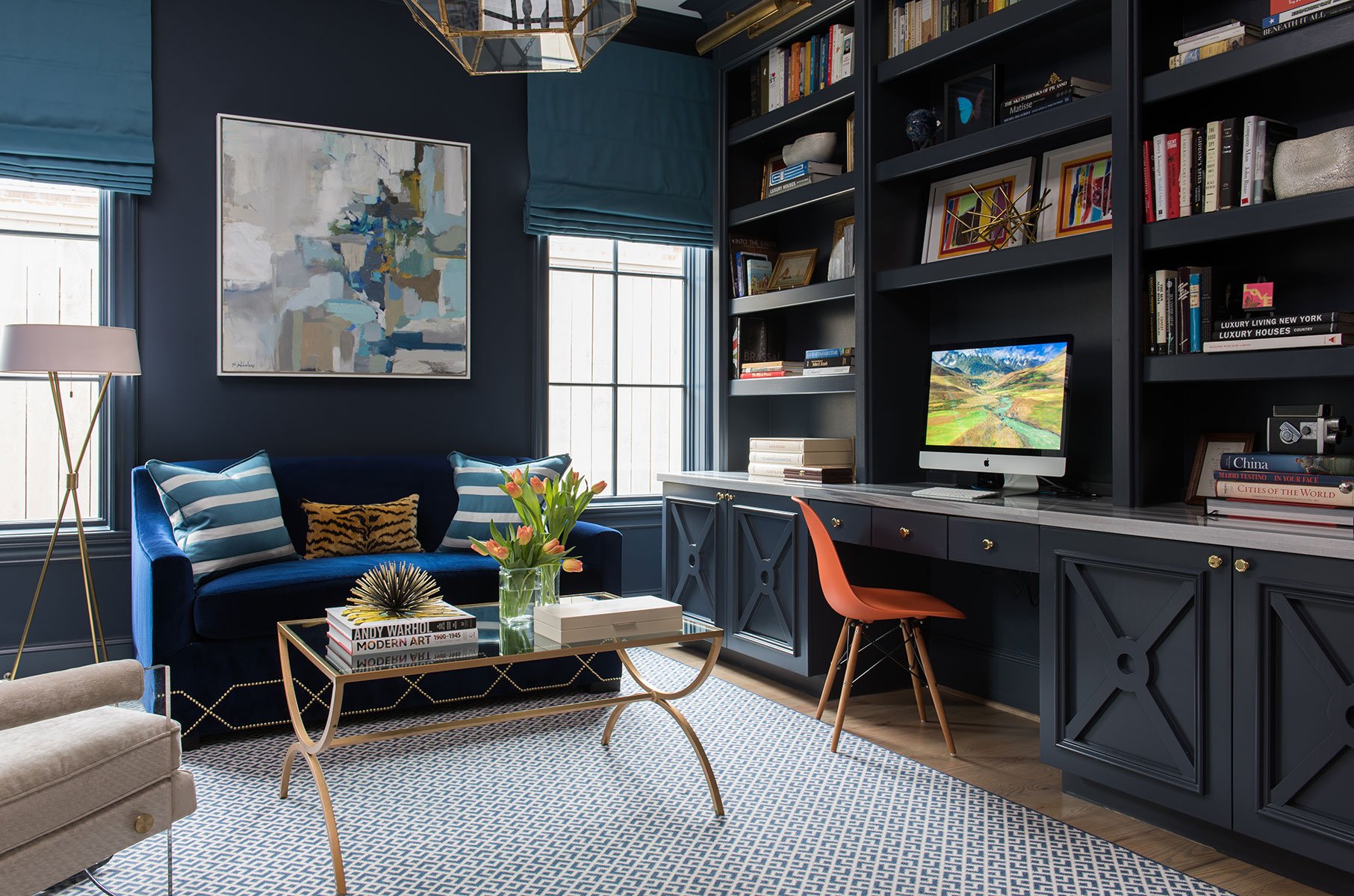
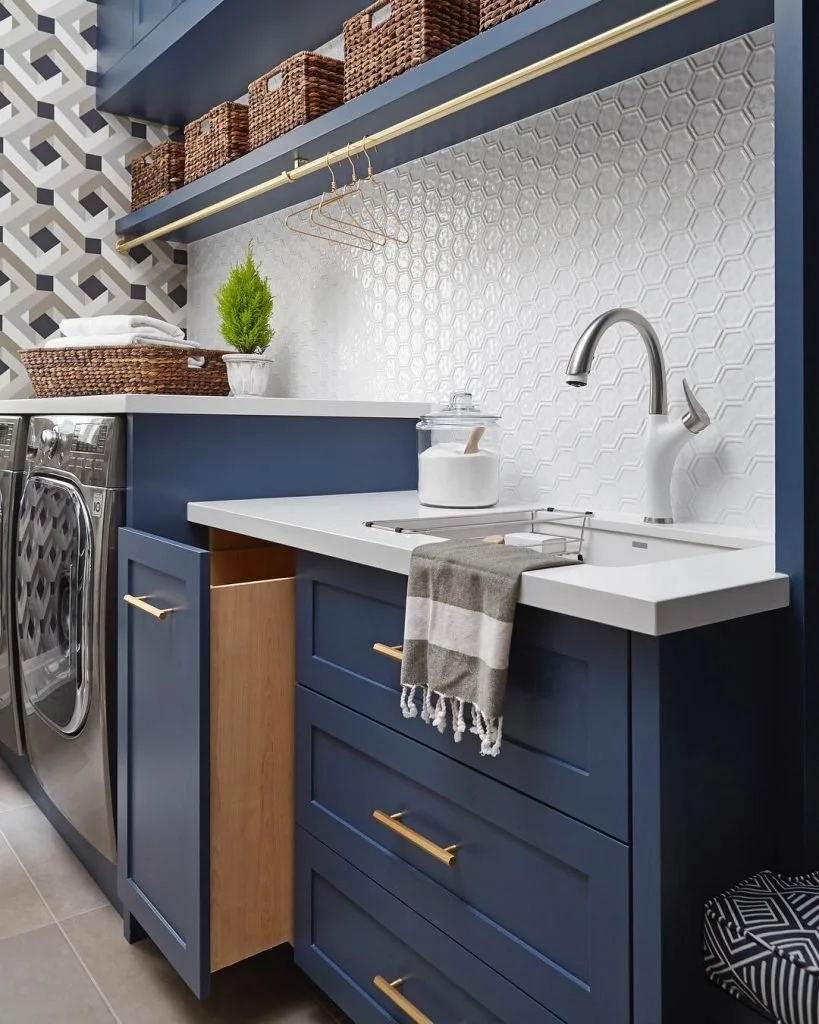
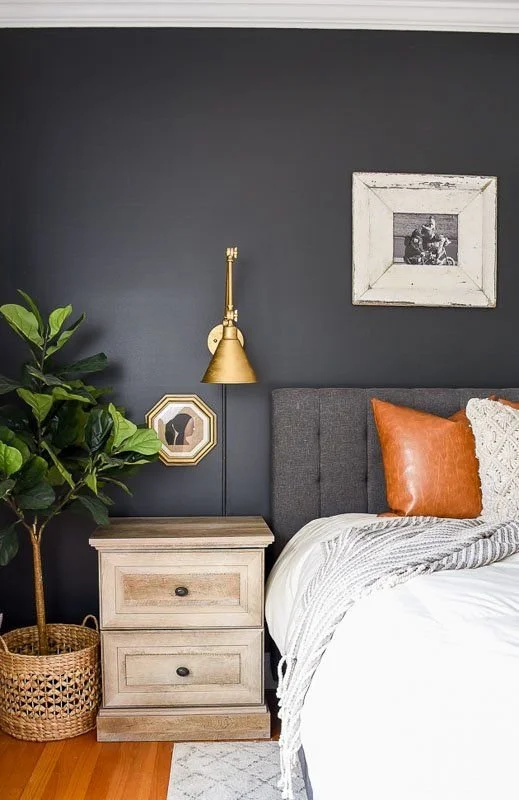
Best Dark Blue and Navy Paint Colors
For a color that is both timeless and trendy then venture into the world of navy and deep blues. These bold hues can work great as accent colors for cabinets and vanities, or for the walls to create a sophisticated, moody, and elegant aesthetic.

For a very dark, almost black, navy blue then Abyss by Benjamin Moore is a gorgeous and calming color.
For both kitchen cabinets in our 7th Street and East Side Casita projects, the clients wanted something bold to contrast with the lighter kitchen finishes. Abyss adds a layer of depth and sophistication to both spaces.

Reminiscent of the ocean on a cloudy day, Sea Serpent by Sherwin Williams is a beautiful deep blue.
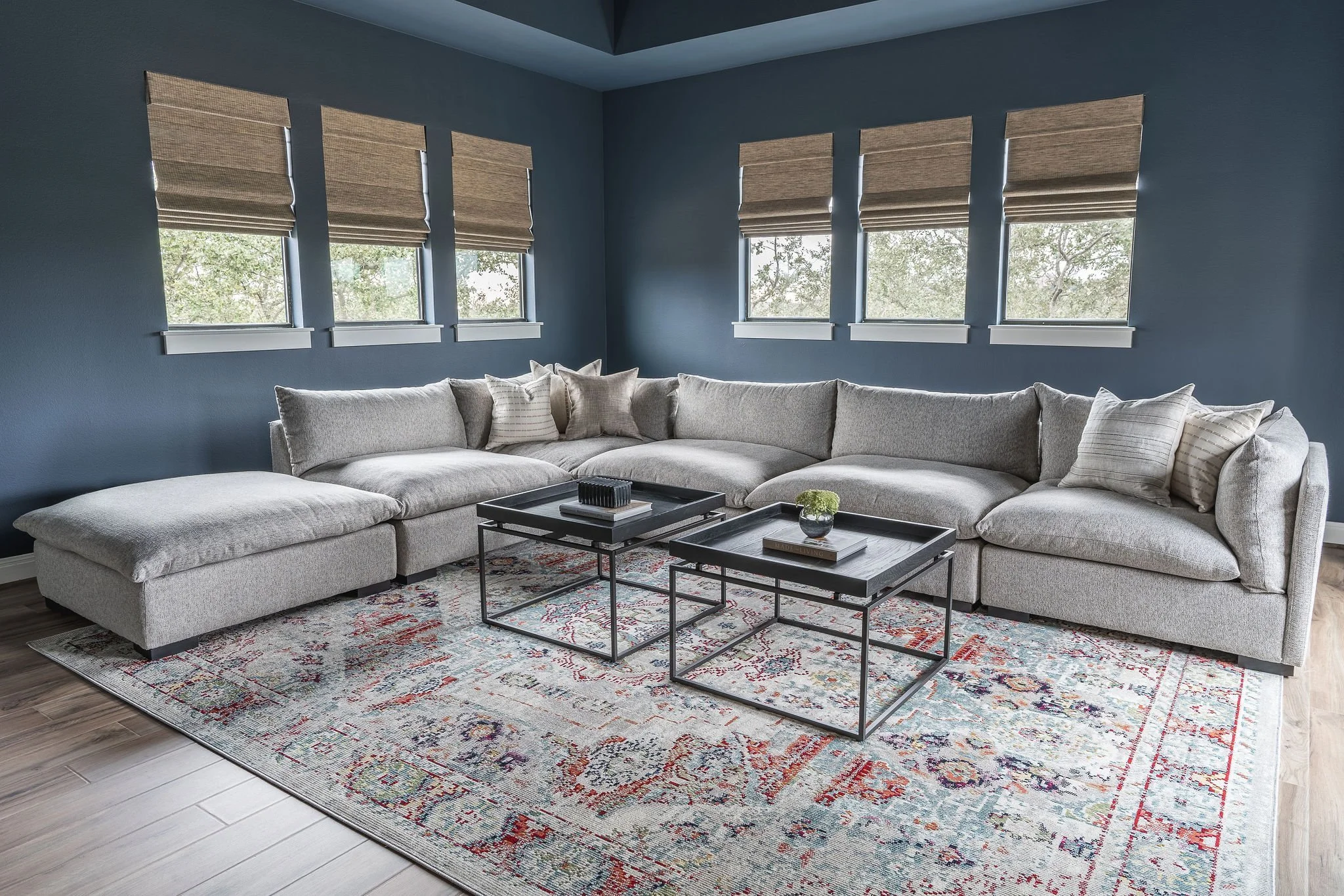
In the media room of our Rugged Earth project, our clients wanted something dark and moody to create a cozy home theater atmosphere. Sea Serpent was the perfect deep blue to create this feeling while complimenting the gray couch and Turkish rug.

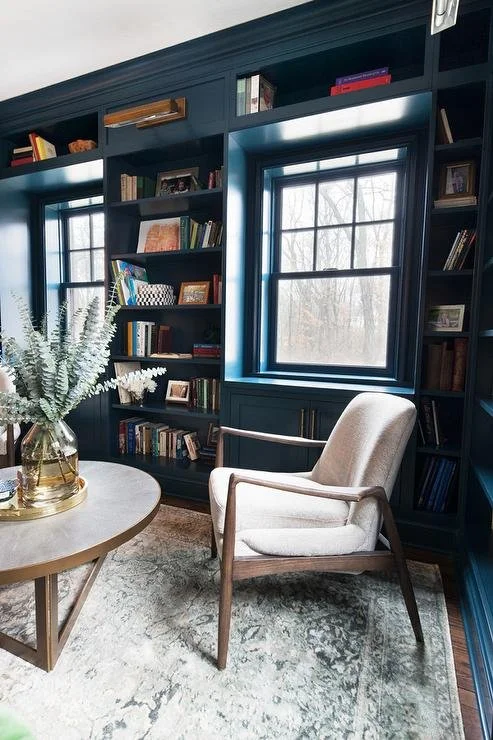
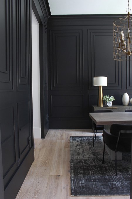
If you want a dramatic blue with green undertones then Hague Blue by Farrow & Ball is a stunning option.
In our Oak Haven project that’s currently in progress, we’ve chosen this color for the office walls. The clients wanted this room to be accentuated from the rest of the home. The space gets lots of natural light so it handles a deep navy well and will act as a dramatic focal point from other areas of the home. We plan to include colorful artwork and a rug to really make the whole space pop.

For a classic and true navy blue that’ll never go out of style, then Hale Navy by Benjamin Moore is your color. It’s a great accent to crisp white walls. A deep bold color, that has enough blue so it’s never confused with black. It’s very versatile and works for a range of styles.

For a bold hue that has rich blackened teal tones then you’ll love Gentleman's Gray by Benjamin Moore. It’s great for any room that you’ll want to feel warm and intimate, like a dining room, office, or guest bathroom.
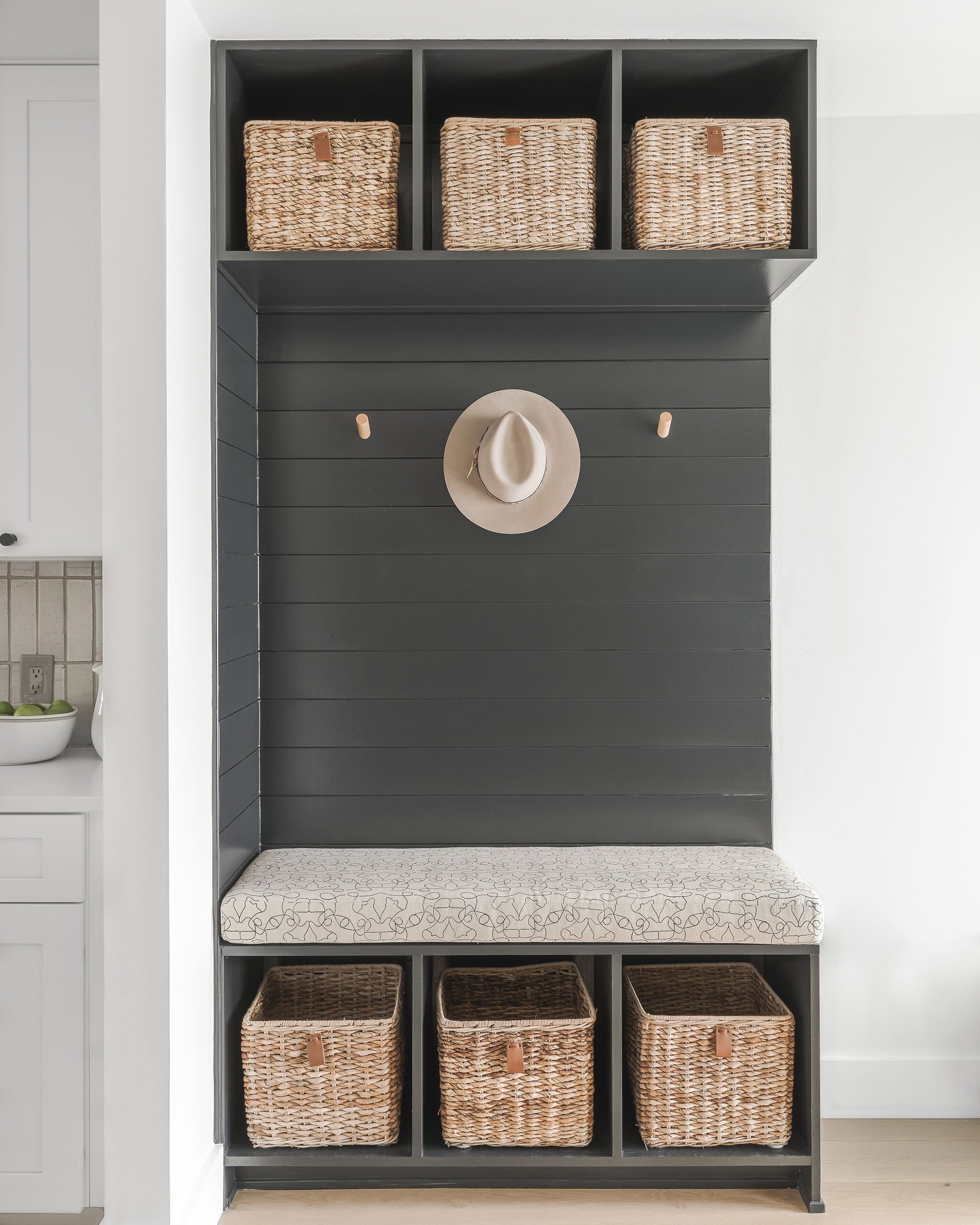
Best Black Paint Colors
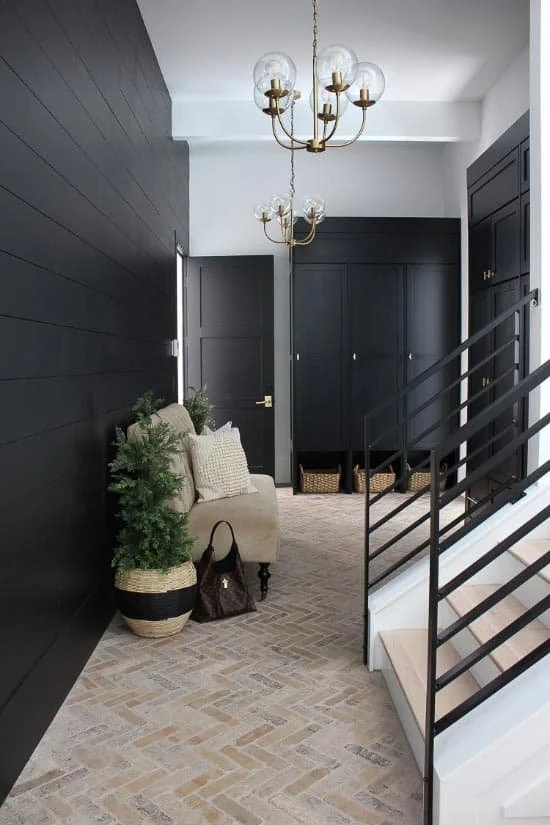
For the darkest of the dark paint colors, we cannot forget black. Like white, there are a surprising amount of black paint colors to choose from, including ones that look more gray or have brown undertones. You’ll want to check out our favorite black paint picks if you're into high contrast and bold shades.

For a true black, that doesn’t read gray or brown then Tricorn Black by Sherwin Williams is a great option for both interior and exterior paint. Perfect for a bold accent wall or exterior trim color, there are a wide range of locations you can use this color.

If you’re looking for a black that’s a bit softer with some brown undertones, then Iron Ore also by Sherwin Williams is a winner. When exposed to a lot of light it’ll look more like a dark gray and in a darker setting it’ll take on a deep inky black look.

Another softer option, with more blue undertones, is Soot by Benjamin Moore. For the patio doors of our Beverly Road project, we wanted a black to contrast nicely with the white walls but one that wasn’t too severe. The rich ashy black of Soot was the best choice.

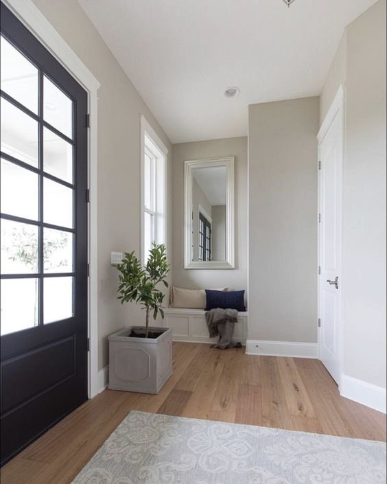
If you’re looking for a classic neutral black with warm undertones, then Off-Black by Farrow & Ball is a great color. In our North Hampton project, we were looking for the best black to paint the mudroom bench area in the entryway. We choose Off-Black to contrast the white walls but also tie into the taupe accents throughout the space.
Inspired by these paint colors, but still having trouble knowing what will work in your space? Let us help! We offer customizable design packages from full-service interior design to furnishing and styling. Get in touch with us today to talk about your design project.